
At a Glance
The map is one of the main ways to find trips on this site. I gave its markers a new look: small round dots in country colours, and clusters that show which countries they hold.
Here’s why the map matters so much, and how the content got granular enough to need one.
Earlier this month, I scrolled through the map on Talewind, a travel app I collaborated with before it got shut down. Small round dots with a thin white ring, nothing else. Then I opened my own map. Red teardrop pins with a white dot in the middle, the kind every map had ten years ago. They worked. Next to that clean look, mine felt old.
Before the new look, a few words on why that map gets this much attention from me.
Why the map matters
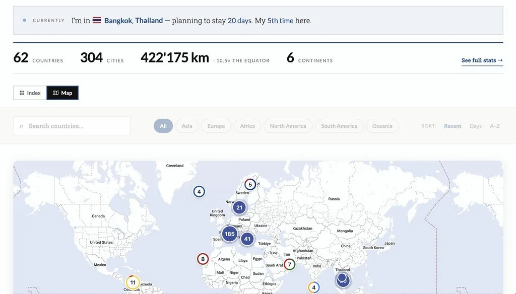
I tag every trip on this site with the places I stayed. 304 cities in 62 countries at the time of writing. A trip to Indonesia knows it went to Canggu, Ubud and the Gili Islands, with coordinates for each. That’s what the map is built from. Every dot is a place, and every place links to the trips that went there. The full map lives on the Explore page and in the map tab of the travel hub.
Search by text works when you know what you’re looking for. A title, a year, a keyword. But most of the time I remember a trip by where it was, not by what I called it. The beach in Lombok. The co-living up the hill in Tenerife. Geography is a different way to search, and for a travel journal it’s the most natural one.
I remember a trip by where it was, not by what I called it.
From yearly reviews to trips
Searching by place wasn’t always possible. From 2017 to 2024, I wrote one review per year. Eight long posts, each covering twelve months of travel in one go. It was a lot of effort, and I published those reviews years late. To find one particular place in them, you had to know the year and months.
Last December I split them up. The yearly reviews became trips, each covering one country or a few together, with a start and an end date. Today there are more than 100 of them. Every section about a place got a location block with coordinates. From there, the map was a small step.
The content is the same as before. It’s just cut finer. A trip has a clear scope, so it can carry a country, a date range and a list of places. That’s exactly what search, filters and the map need.
Smaller pieces are easier to find and more relevant.
The new markers
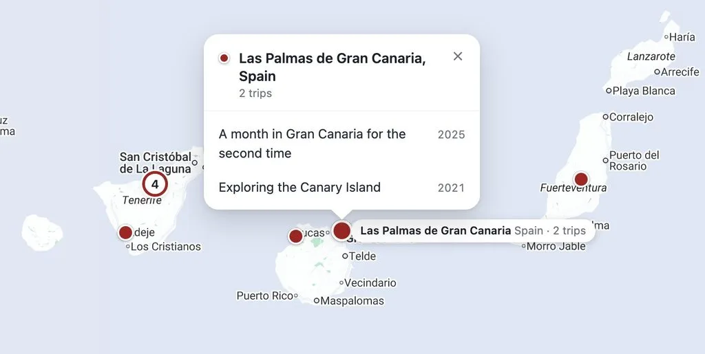
Back to the redesign. The pins are gone. Every place is now a small round dot with a white ring. Its colour comes from the country, mostly taken from the flag. Red for Indonesia, gold for Thailand, navy for Malaysia. Hover over a dot to see the city, the country, and how many trips went there.
Clusters got the same treatment. Where places sit too close to tell apart, they merge into a circle with a count. Its ring is split by the colours of the places inside, so a cluster over Bali is all red. Once a cluster holds more than three countries, it turns solid blue. Otherwise Europe would look like a rainbow.
Click a dot and a popup lists every trip that went there, newest first, with the year. Each link jumps straight to that place inside the trip, not just to the top of the post.
I’ll admit it. I now scroll around the map for no reason. Zoom into Southeast Asia, watch the clusters break up into coloured dots, click on a city I’d almost forgotten. It’s delightful in a way the pins never were.
The map is now a delighful experience to explore trips of mine.
Maps inside trips
The map doesn’t only live on the overview. Every trip opens with its own map. The places of that trip show in colour. All my other places stay on the map as small grey dots, so you see where the trip sits in the bigger picture.
Clicking one of the trip’s dots jumps down to that section, or lists the other trips that went there too. For a long trip like Exploring Indonesia in depth, with 18 places in two months, that’s the quickest way to get an overview before reading.
Location pages
The newest home for the map is also the newest content format. Since this spring, there are pages for countries, regions and cities. Each one collects the trips that went there. Each one has a map, with its own places in colour and the rest of the world in grey. Open Indonesia and you land right on the archipelago, with Bali and Lombok in red.
That’s where the map does its best work. You don’t need to know a single trip title. Orientation comes first, the reading after.
You pick a place and the trips come with it.
Conclusion
The content was on this site for years. It only became easy to find once I cut the yearly reviews into trips and gave every place its coordinates.
The map turns that into something you can browse by place. With the new markers, it’s one I enjoy using myself.